How I'm using a gallery wall to downplay our TV
If you've been following the blog or Instagram, then you probably know that our renovation finished in October and we're slowly adding the finishing touches. As a decorator this is my absolute favourite part, I obsess over every detail. And I love every second of it!
The other day my mother-in-law the other day remarked that she was surprised that we went with such a dark wall colour in our living room. This is a bit of an unconventional choice for me, given my love of white walls. But I've been using dark walls in some recent projects and I really love the vibe it creates (this project for example). Aside from loving the vibe through, there were strategic reasons for choosing a dark wall.
A big change in our living room was moving the TV from the fireplace mantel to the opposite wall. We rarely watch TV in this room and I hated that the TV was the focal point.
Good design is all about the details, and that includes many, many elements, but today I want to talk about sight lines. I consistently see sight lines being overlooked, particularly sight lines from other rooms in your home.
Like this one.

This is the view to the living room from our music nook, and a big reason why I choose a dark wall. As decorators and designers we're making thousands of design decisions for our projects. Some we make because it feels right, or simply because we like something. But the majority of design decisions are about tricking our eyes into thinking something is balanced when it's not, or downplaying things we don't love. And just like I do with clients, sometimes I have to crush my own dreams, because the design or element I hoped for just doesn't work in the room. No room is ever about one specific item, it's about the way all the elements in the room work together to create a mood, balance and please your eye.
The green wall you see above is where our TV is moving. Side note, I also happen to love when colours peek through doorways, so this is an added bonus here. The dark wall downplays the TV by minimizing the contrast. Even with the minimal contrast, I still felt the TV would be too predominant even on the dark wall, so that's what I decided to incorporate the a gallery wall.
It's likely no secret that I love art and gallery walls. My father is a professional artist, so I grew up around art my entire life. I gravitate towards edgier art, normally that's a bold portrait or abstract. The key to a great gallery wall is balance. Abstract art is a really effective way to balance out my edgier pieces.
When I first laid my eyes on the print below from Photowall, by Mike Schick, I fell in love. It has an organic feel which is very trendy right now, but it's also a classic piece that will never go out of style.

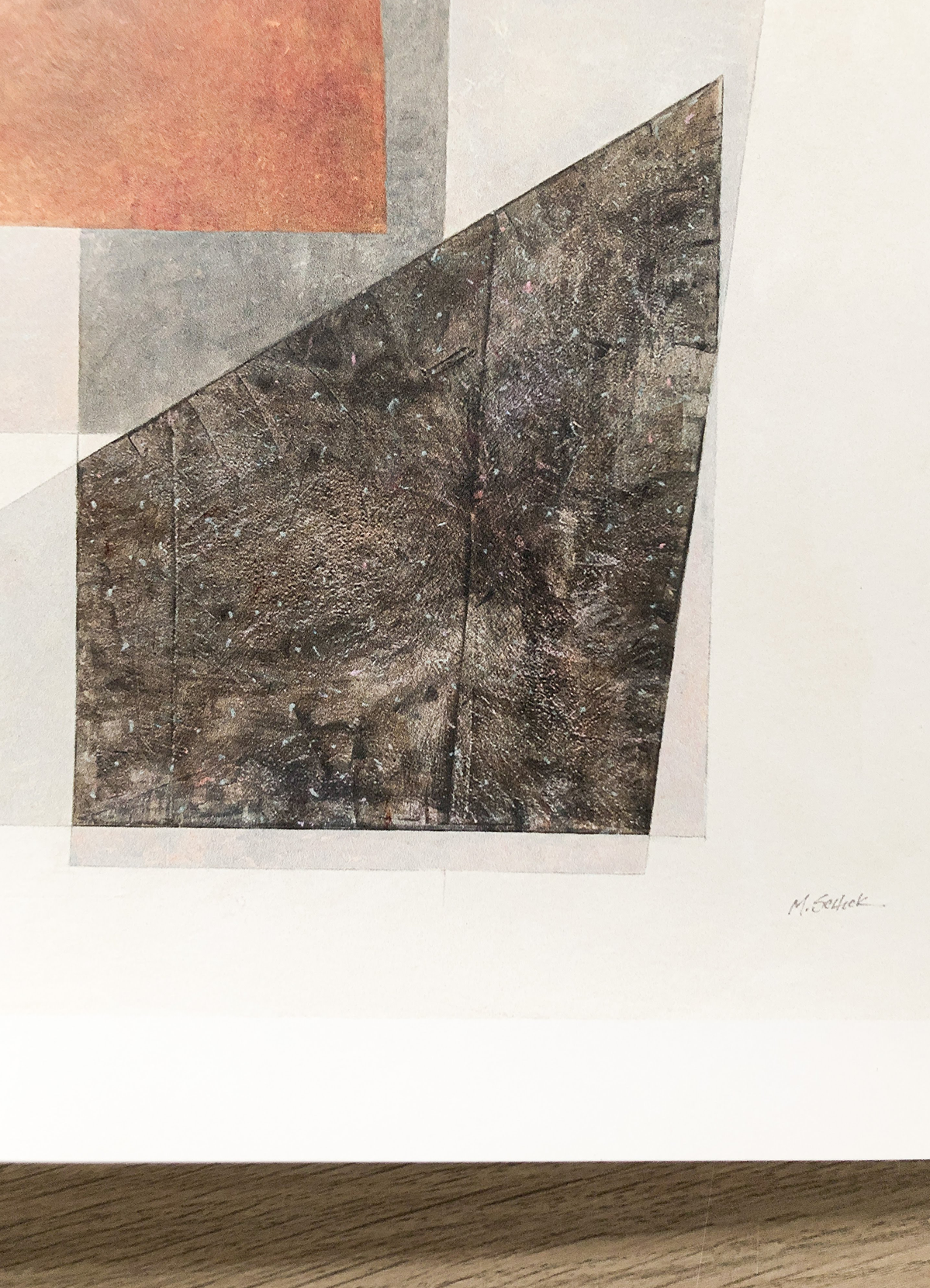
It's a bit hard to make out in the photo above, but the print has a slight shimmer, but in a subtle beautiful way. The paper quality and finish isn't like anything else I've seen and might be one of my favourites yet.
Once I found this piece it was time to get to work on planning. When it comes to gallery walls, I am a real stickler for balance. Whether it's the size of the art (mixing large and small) or the art itself (making sure the colours, subject matter of the pieces feel balanced), I pay attention to every detail to ensure it works. Pre-planning is also helpful if you're custom framing because you'll know how big to mat your art to play with scale and what frames work best collectively.
I started by taking a photo of the wall and placing it into Keynote (aka Powerpoint for PC users). From there I play with possible art size configurations until I like the balance. Once I land on the configuration I will bring in art I'm considering. I do use Sketchup (a design program) to ensure I'm adding existing art I might already own to the right scale, but you can always eyeball that. Once I find the configuration I like, I take it to photoshop to make it look a bit more realistic.

This process is tedious, but I have fun doing it (aka become borderline obsessed as Dave's points out) and it gives me the confidence to make the right decisions and avoid costly mistakes! The image below shows where I've landed. Once we have the sideboard, I'll place the TV and actually tape out all the frames onto the wall and assess from in the living room as well as from my chair in the music nook. Tip: If you'll be seeing a gallery wall often from a side view, I recommend going a little wider with your gaps than normal, this ensures that you'll still see gaps between art when looking at it from an angled view.

