Project Reveal: A Stylish Toronto Condo

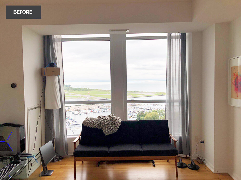
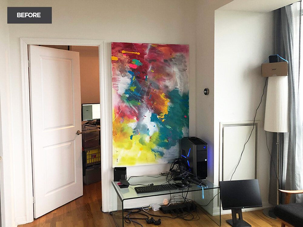
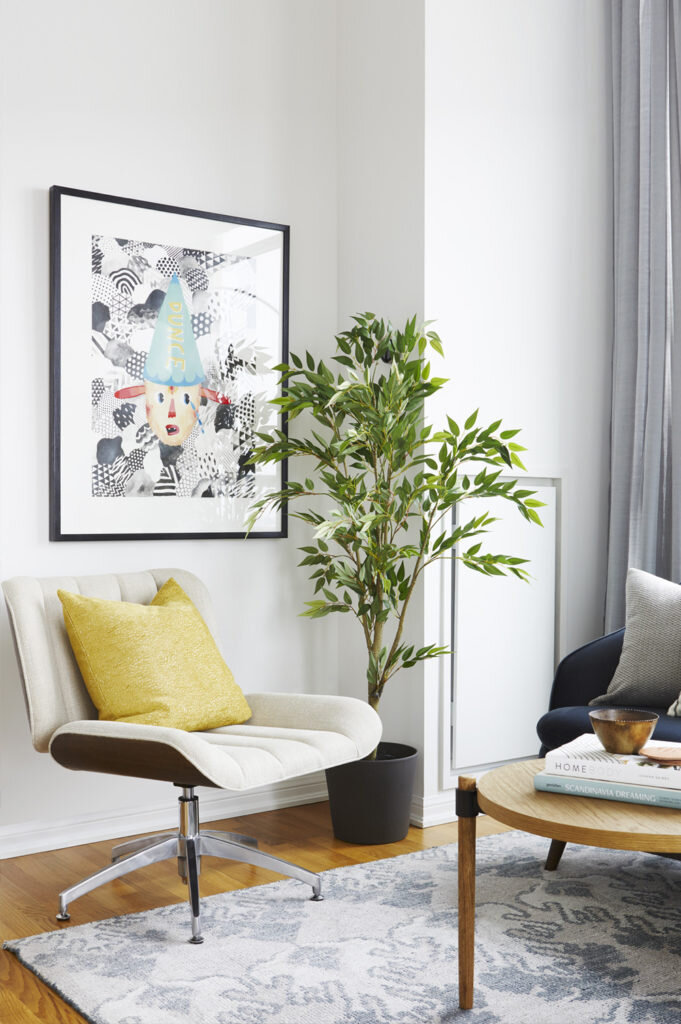
Oh project reveals, how I love you! Especially when accompanied by some glorious before photos. This client already had some incredible art. But a common mistake I see people make is placing art on the wrong walls due to scale and proportion. I really like there to be some breathing room on a wall to allow your eye to rest. In the after photos you'll see a lot of their existing art repurposed throughout their condo.
By now you probably know how I feel about gallery walls. And if you don't, well my thoughts and feelings are this...I love them. On the right wall, in the right space of course. Behold, the perfect wall and space.☝️
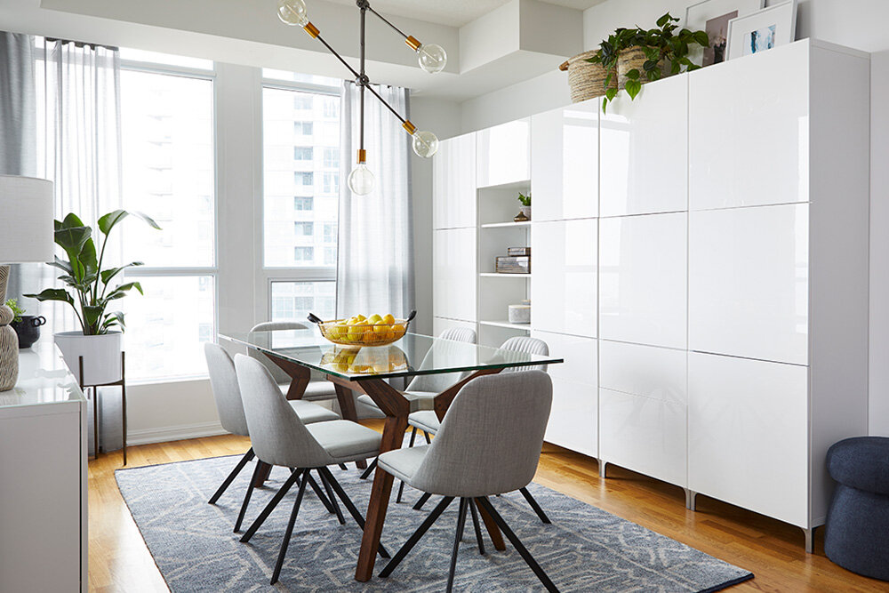
The dining room had a lot of furniture they wanted to keep; the table, the side board and the cabinets. A well-designed space mixes textures, patterns and finishes, so that was my goal with this space. And obviously, replace the boob light (ok, it's not exactly a book light per se, but I wanted to say boob light for effect).
Sometimes simple changes pack a big punch. These cabinets made for some great (and much-needed) storage, but the imbalance on the top was throwing my eye, so we removed the top layer of cabinets to clean up the lines. They also needed to keep a gap in the cabinet (where the guitar sits) to allow for panel access.
Function
is always of high importance, but I am gonna need
form
as well, so my suggestion was to add shelves in the recess to make the piece feel more complete and provide an opportunity for shelf styling (go ahead and add shelf styling up there with my love of gallery walls). Wait till you see the after below!
All I can say is the transformation here is INSANE. Wait for it..... (and this room DOES have a legit boob light, don't worry we got rid of that one too!).
All the views, outside anyway. ;)
More amazing art, but not the right wall, we flipped this piece on its side moved it into the kitchen (not photographed, but I promise it's amazing!).
THE REVEAL
I've designed a few pieces of furniture for my clients over the years, but this one I especially love! Because custom beds can be a bit pricey we designed this so the side panels can be removed and the bed can still be used if they move to another home. Thanks to Teb Interiors for their amazing work bringing my vision to life!
We went dark, real dark in the bedroom, and we went all in, as opposed to the non-committal accent wall. When a wall colour is this good, you commit.
Follow #mbdcondowithaview on instagram


